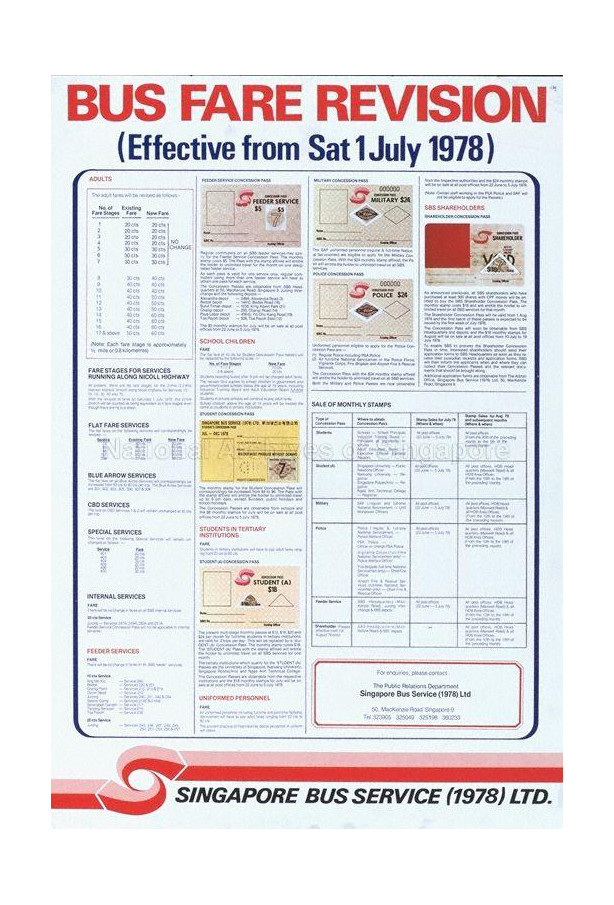
Singapore Bus Service (1978)

Logo for a public bus company
| Designer |
Central Design (中央設計公司),William Lee Siew Choon (李秀镌) |
||||||||||
|---|---|---|---|---|---|---|---|---|---|---|---|
| Client |
Singapore Bus Service (1978) |
||||||||||
| Year |
1978 |
||||||||||


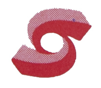
The red and pink logo is made up of arrows in flowing movement and the circle in the centre. The two arrows convey action, efficient management of the transport system and centralised planning.
William Lee had left out the initials of the company, SBS, as it was to be used on moving buses. He felt his simple logo would be easier on the eye and easily recognisable.
In 1983, the logo was replaced.
| References |
|
||||||||||
|---|---|---|---|---|---|---|---|---|---|---|---|