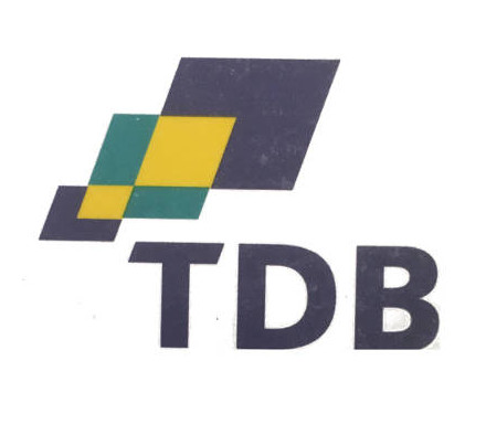
Trade Development Board

Redesigned logo for a government agency promoting trade
| Designer |
|
||||||||||
|---|---|---|---|---|---|---|---|---|---|---|---|
| Client |
Singapore Trade Development Board |
||||||||||
| Year |
1998 |
||||||||||

This logo replaced an earlier design, and it reflected the agency's expanded role not just in promoting Singapore's products and services worldwide but also of developing the country as a global city of international trade.
The corporate colours of dark blue, yellow and turquoise reflects its reliability, vibrancy and growth respectively. The three overlapping diamonds express the multifaceted approach of TDB as well as the positive integration of its three main roles: trade facilitation, trade promotion and trade policy. The upward slant of the diamonds signifies the trajectory of growth.
| References |
|
||||||||||
|---|---|---|---|---|---|---|---|---|---|---|---|