Real Estate Developers' Association Singapore (REDAS)

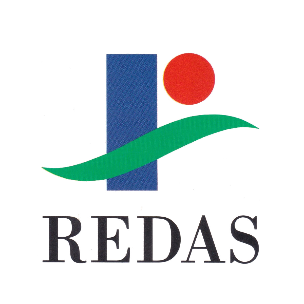
Redesigned logo of an organisation representing real estate developers in Singapore
| Designer |
Addison Design Consultants |
||||||||||
|---|---|---|---|---|---|---|---|---|---|---|---|
| Client |
Real Estate Developers' Association Singapore (REDAS) |
||||||||||
| Year |
1993 |
||||||||||

This new logo was commissioned to reflect the organisation's new role of encouraging developers in Singapore to expand their business overseas. It came just seven years after REDAS introduced a redesigned logo, the second since it was founded in 1959.
This third iteration consisted of a blue pillar with a red circle and a green curve running across it. The blue pillar represented development, while the circle was to be read as the sun to symbolise "the dawn of a new era where man and his environment are bought into harmony" as well as the "global outlook" that the organisation would respond to. The green curve resembling a leaf expressed the sweeping landscape.
The pillar and circle also suggest the letter 'r' while the curve signifies a 'pass' tick. Together, the three elements stood for quality as well as the integration of the natural and built environment.
| References |
|
||||||||||
|---|---|---|---|---|---|---|---|---|---|---|---|