Holland Town Council

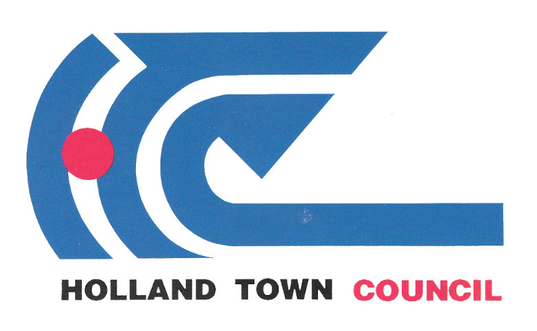
Logo for a town council in charge of Buona Vista, Tanglin and Ulu Pandan
| Designer |
See Hak Hiok,Berwin See Hak Gei (施学艺) |
||||||||||
|---|---|---|---|---|---|---|---|---|---|---|---|
| Client |
Holland Town Council |
||||||||||
| Year |
1991 |
||||||||||

The initials "HTC" were created by adapting the arcs of 3 concentric circles to symbolise the constituencies under the council's care: Buona Vista, Tanglin and Ulu Pandan. They also hint at its strength and perfection.
The arrow symbolises the council's forward-looking aspirations, while the letter H resembles a figure with outstretched arms to indicate the residents' support. This is emphasised with a red dot to indicate they are the heart of the estate. The blue colour was selected to complement the red and also suggest strength and energy.
This design beat 177 other entries in a month-long contest held by the town council in February 1990. The eventual winner, See Hak Hiok, won a $1,000 prize and a trophy.
This logo was later replaced when it became part of the Holland-Bukit Panjang Town Council.
| References |
|
||||||||||
|---|---|---|---|---|---|---|---|---|---|---|---|