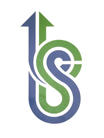
Bishan-Serangoon Town Council

| Designer | |||||||||||
|---|---|---|---|---|---|---|---|---|---|---|---|
| Client |
Bishan-Serangoon Town Council |
||||||||||
| Year |
1991 |
||||||||||

This "dual-strand" logo integrates the letters 'b' (Bishan) and 's' (Serangoon) to represent the unity of the residents and town council in working out problems. The arrow suggests this process may go on a winding path but it leads to a straight road eventually. The colours blue represent clean air and clear sky while the green represents flora.
| References |
"Our Logo". Bishan Serangoon Town Council News. September 1991, Volume 1, No. 1. |
||||||||||
|---|---|---|---|---|---|---|---|---|---|---|---|