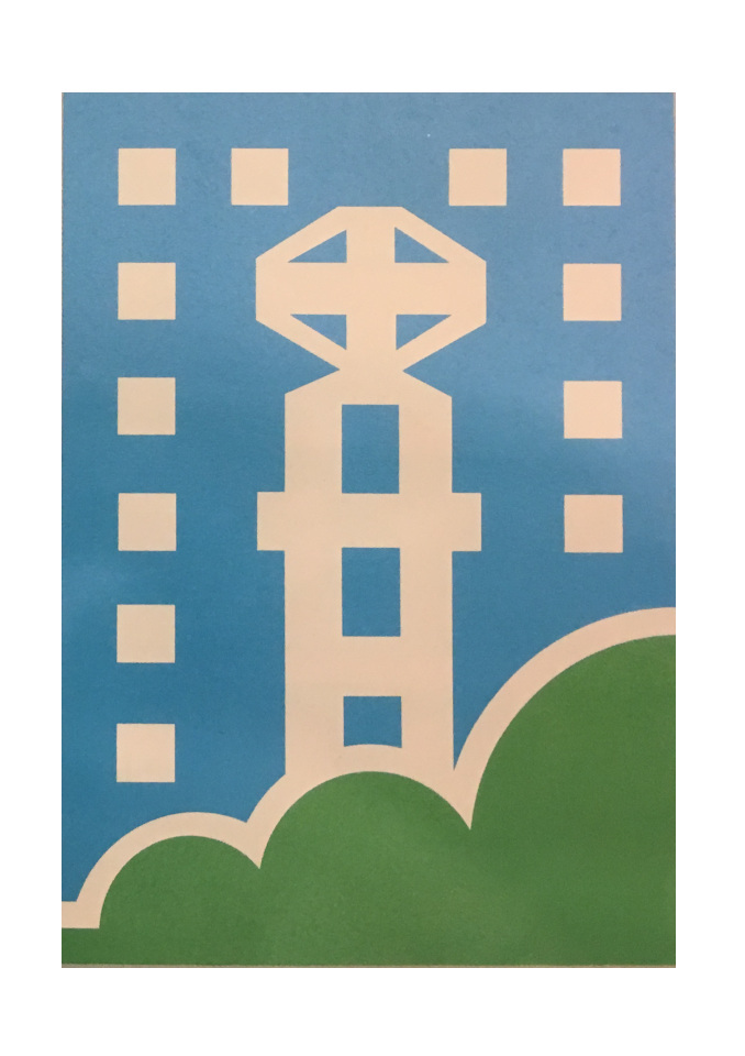
Toa Payoh Town Council

Logo for a managing body in charge of Toa Payoh
| Designer |
|
||||||||||
|---|---|---|---|---|---|---|---|---|---|---|---|
| Client |
Toa Payoh Town Council |
||||||||||
| Year |
1989 |
||||||||||

The logo depicts Toa Payoh, notably its iconic viewing tower at the town garden. The blue and green colours represent a "fresh, clean and healthy" environment which is the objective of the town council and the national ideal of creating a garden city.
The three green semi-circles of different sizes are linked and said to represent the co-operation of the different races working together.
The town council was made out of the political constituency of Toa Payoh and Kim Keat. It was chaired by Dr Ho Tat Kin, then the Member of Parliament for Toa Payoh Group representation constituency.
| References |
|
||||||||||
|---|---|---|---|---|---|---|---|---|---|---|---|