United Overseas Land

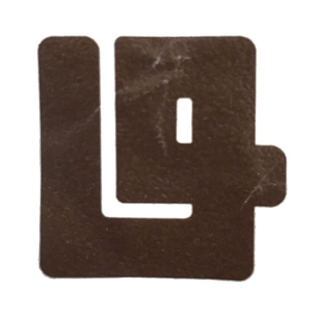
Logo for the property developer arm of United Overseas Bank
| Designer |
|
||||||||||
|---|---|---|---|---|---|---|---|---|---|---|---|
| Client |
United Overses Land |
||||||||||
| Year |
1975 |
||||||||||

An amalgamation of the initials of United Overseas Land (UOL), this logo is an abstract form of a basic element in construction—a steel reinforcement rod. The thickness symbolises the property developer's forward looking outlook and solid character and the brown denotes the land on which all its developments are built upon. In 1979, this logo was replaced.
| References |
|
||||||||||
|---|---|---|---|---|---|---|---|---|---|---|---|