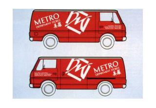
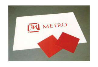
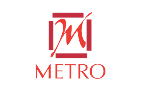
Logo of a departmental store started by Ong Tjoe Km in 1957
| Designer | |||||||||||
|---|---|---|---|---|---|---|---|---|---|---|---|
| Client |
Metro |
||||||||||
| Year |
1982 |
||||||||||


This logo consists of two wordmarks—a customised hand-lettered Metro in English and a brush-lettered calligraphy in Chinese. The bars framing the ‘M’ and the stylised M is a creative representation of a seal and reminiscent of the departmental store's original seal logo from the 1970s.
The new logo has an ‘East meets West’ influence and reflect Metro's Asia heritage and its international and modern appeal. The use of red continues the store's longstanding association with the Chinese colour for good fortune.
The name of this departmental store started by Ong Tjoe Kim (王梓琴) in 1957 was originally inspired by his passion for the silver screen movies and the famous Metro Goldwyn Mayer movie studio. Its logo started out as a name spelled in very basic typography, and was often paired with the Chinese calligraphy words "美羅" written by the founder’s brother. These 2 Chinese words not only sounded like ‘Metro’ but carried a deeper meaning in Chinese, which means ‘beautiful textiles/clothes’ (美丽的绫羅绸缎)and “has everything /all embracing” (包羅万象). This reflected a time when Metro not only sold clothes, but also textiles and every a variety of lifestyle goods.
In the early 1970s, the logo evolved into an ancient Chinese seal with the pair of original calligraphy words, "美羅".
| References |
|
||||||||||
|---|---|---|---|---|---|---|---|---|---|---|---|