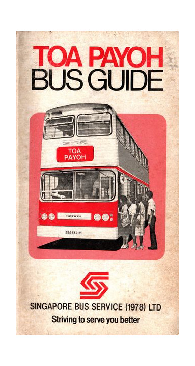
Singapore Bus Service (1978)

Logo for a public bus company
| Designer |
Ted Bates |
||||||||||
|---|---|---|---|---|---|---|---|---|---|---|---|
| Client |
Singapore Bus Service (1978) |
||||||||||
| Year |
1983 |
||||||||||


The logo’s arrows symbolises the comprehensive network of services it operates. It also resembles two hands clasped together, reflecting the teamwork and harmony within the company. Red is used to signify the strength and dependability of this transport company, while the white represents the harmonious relationship between Singapore Bus Service (SBS) and its passengers.
The design replaced SBS's original logo. In 2001, this logo was replaced when the company was rebranded as SBS Transit Limited.
| References |
|
||||||||||
|---|---|---|---|---|---|---|---|---|---|---|---|