National Productivity Board

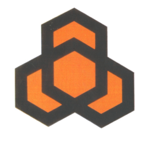
Logo for a national agency to promote productivity
| Designer |
Bozell Jacobs Kenyon and Eckhardt |
||||||||||
|---|---|---|---|---|---|---|---|---|---|---|---|
| Client |
National Productivity Board |
||||||||||
| Year |
1986 |
||||||||||

The design portrays the board’s tripartite role with labour, management and government in a stylised graphic representation of three arrows, interlocking and converging into a honeycomb. The three arrows all reach upwards and outwards which signify striving for higher excellence in each field, yet all working simultaneously together to achieve collective excellence through higher productivity.
The logo was the winning entry in a competition involving five advertising agencies. The black and yellow honeycomb was chosen for its symbolism and relevance to Teamy, the mascot for the national productivity movement.
The design replaced the original plum-coloured logo of the board founded in 1972. In 1996, the NPB merged with the Singapore Institute of Standards and Research (SISIR) to form the Productivity and Standards Board (PSB).
| References |
|
||||||||||
|---|---|---|---|---|---|---|---|---|---|---|---|