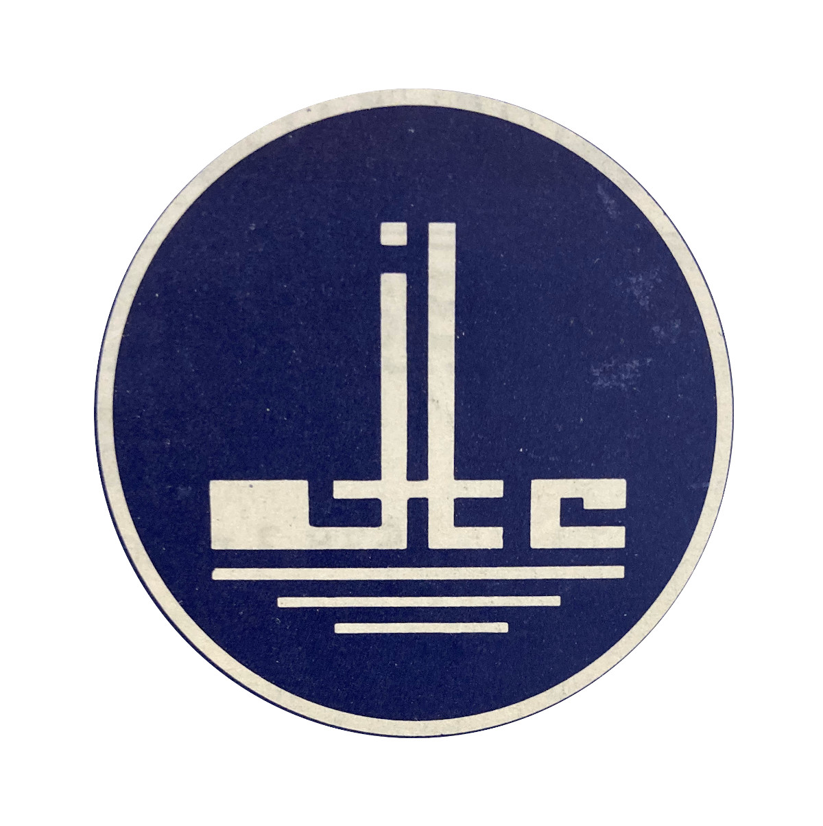
Jurong Town Corporation

Logo for a national agency overseeing industrial development
| Designer |
|
||||||||||
|---|---|---|---|---|---|---|---|---|---|---|---|
| Client |
Jurong Town Corporation |
||||||||||
| Year |
1968 |
||||||||||

The agency was set up in 1968 to take over from the Economic Development Board in developing and manage industrial estates in Singapore. It uses the initials of the agency to symbolise the factories, flats and social amenities in an industrial town. The blue backdrop represented the ocean on which the town’s products would be exported on around the world, while the three white lines below the initials denoted the waters around its industrial estates—Jurong River, Kranji River and Kallang River—as well as the Jurong Wharf.
In 1988, the corporation which oversees industrial development in Singapore announced a call for a new logo to better reflect its role as an industrial authority. It felt this design featured elements associated with sunset industries.
| References |
|
||||||||||
|---|---|---|---|---|---|---|---|---|---|---|---|