Hwa Chong Junior College

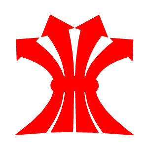
Logo for the first government-aided junior college offering pre-university education
| Designer |
Central Design (中央設計公司),William Lee Siew Choon (李秀镌) |
||||||||||
|---|---|---|---|---|---|---|---|---|---|---|---|
| Client |
Hwa Chong Junior College |
||||||||||
| Year |
1974 |
||||||||||

The logo has four red arrows shooting upwards, bound together by a horizontal bar. The arrows symbolise the four faculties of the College (Arts, Commerce, Science and Technical) and its four educational aims (social, moral, intellectual and physical). The horizontal bar signifies the unity of the four faculties in the achievement of the education aims. The upward direction of the arrows portrays the College motto of “Towards Progress”. The overall look of a rice harvest also symbolises the result of Singapore's multiracial society coming together for education.
With the closure of faculties such as Technical in later years, the meaning behind the arrows was revised to symbolise the four educational aims of the College, while the horizontal bar represents the synthesis of the four educational aims in developing the character and corporate unity of the students.
In 2005, the junior college merged with The Chinese High School to form Hwa Chong Institution and this logo was dropped.
| References |
|
||||||||||
|---|---|---|---|---|---|---|---|---|---|---|---|