Aljunied Hougang Town Council

| Designer |
|
||||||||||
|---|---|---|---|---|---|---|---|---|---|---|---|
| Client |
Aljunied Hougang Town Council |
||||||||||
| Year |
2011 |
||||||||||

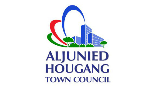
After The Workers’ Party won Aljunied Group Representation Constituency in the 2011 General Elections, it merged Aljunied Town Council with the neighbouring Hougang Town Council which it had been running for the last two decades. A competition was held to determine this new town council’s logo. The brief for the $800 prize was “Designs should reflect vibrancy, originality and creativity”.
Of the 197 logos submitted, Norman Teo won the contest with this logo that “embodies the desire to have a life of tranquility and peace in a pleasant living environment, with comfortable homes surrounded by nature”. The three different coloured rings symbolise what the Town Council and residents strive to achieve together, and a threaded together to depict an integrated community. The green ring represents a fresh, clean and healthy environment; the red symbolises vibrancy, energy and camaraderie among residents; and the blue ring represents efforts to promote goodwill and social cohesion, so as to build a strong sense of community.
| References |
|
||||||||||
|---|---|---|---|---|---|---|---|---|---|---|---|