Singapore Telecom

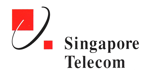
Logo of a telecommunications corporation
| Designer | |||||||||||
|---|---|---|---|---|---|---|---|---|---|---|---|
| Client |
Singapore Telecom |
||||||||||
| Year |
1992 |
||||||||||

The logo combines an ellipse and two squares to represent the corporate entity formed from the split-up of Telecoms, once known as the Telecommunications Authority of Singapore.
The ellipse signifies the dynamism of this telecommunication company's global networking and international activities while the squares symbolise the high-tech nature of the industry. Red and black were strong basic colours selected to symbolise the solid foundation the company was built upon. Finally, the choice of a "traditional" serif typeface, Times Bold, is married wit the modern look to also convey warmth and friendliness.
Over the years, Singapore Telecom was shortened to "SingTel", and in 2015, the logo was replaced as part of a rebranding exercise.
| References |
|
||||||||||
|---|---|---|---|---|---|---|---|---|---|---|---|