Singapore Press Holdings Group

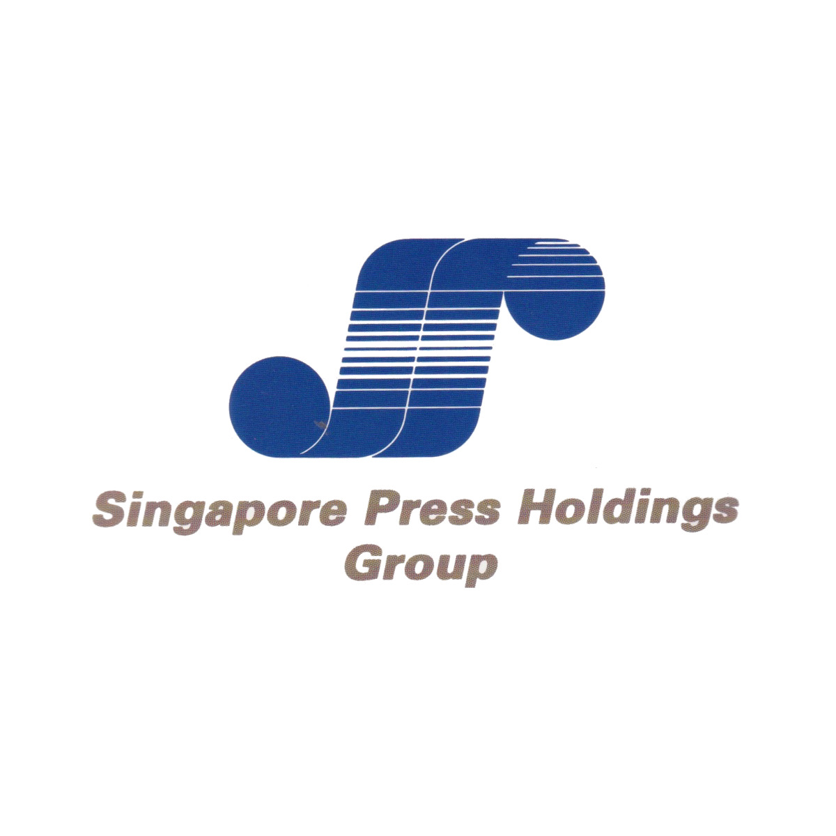
Logo of one of the country's largest media group
| Designer |
Hengdesign Associates,James Heng |
||||||||||
|---|---|---|---|---|---|---|---|---|---|---|---|
| Client |
Singapore Press Holdings Group |
||||||||||
| Year |
1987 |
||||||||||

The publishing group was formed in 1984 from a merger of Times Publishing, The Straits Times Press and Singapore News and Publications Ltd. It led to the search for a corporate logo that was initially conducted in-house. On 12 December 1986, the company opened the design competition to the public and offered a $2,000 prize money.
Then Singapore Press Holdings (SPH) chief executive Frank Yung invited HengDesign Associates to participate having previous worked with the studio. It eventually won the competition with a log featuring a printer's ink blue web and rollers of a newspaper printing press. It represents Singapore Press Holding's (SPH) aspiration to become a global communicaitons with new technology. This is captured by a solid circle on the left, representing the cohesiveness of the organisation, advancing to an upper circle through two parallel columns that form a 'H' to represent the organisation soaring towards a high-technology future. The horizontal white lines across the logo symbolise dynamism and motion.
The logo was replaced in 2024 with the conversion of SPH into a non-for-profit trust.
| References |
|
||||||||||
|---|---|---|---|---|---|---|---|---|---|---|---|