Public Utilities Board

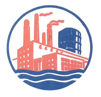
Logo for a agency supplying power, gas and water
| Designer |
Chew Man Cheong |
||||||||||
|---|---|---|---|---|---|---|---|---|---|---|---|
| Client |
Public Utilities Board |
||||||||||
| Year |
1965 |
||||||||||

The PUB was set up in 1963 to unify the once separate corporations or board managing the public utilities of electricity and gas. The logo depicts a power station, gas holder and flowing water all enclosed within a circle. They denote the three essential utilities—electricity, water and gas—handled by the board.
The logo emerged from a public competition won by commercial artist Chew Man Cheong. It was picked from the 1,000 entries received, and Chew was rewarded with a prize of $1,000. The competition was the third organised by PUB in its year-long search for perfect logo. The first was held only amongst employees, then secondary school students, and finally the public.
In 1977, the logo was replaced by a new design to signify the 24-hour service it rendered.
| References |
|
||||||||||
|---|---|---|---|---|---|---|---|---|---|---|---|