Jurong Birdpark

Logo for an aviary and tourist attraction
| Designer | |||||||||||
|---|---|---|---|---|---|---|---|---|---|---|---|
| Client |
Jurong Birdpark |
||||||||||
| Year |
1986 |
||||||||||

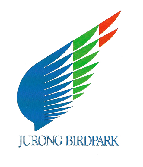
Created to mark the 15th anniversary of the Jurong Bird Park, this open wing-shaped logo suggests free flight while the bold splashes of blue, green and red symbolise the colourful birds the park has.
This design replaced its previous logo featuring three white swans flying against a waterfall in a circle of green. It was found to be dated and impractical to reproduce because of the many details.
The park originally considered logos featuring a single bird, such as the flamingo or the White-Bellied Sea-Eagle. However, it eventually went for a design that was representative of all birds.
| References |
|
||||||||||
|---|---|---|---|---|---|---|---|---|---|---|---|