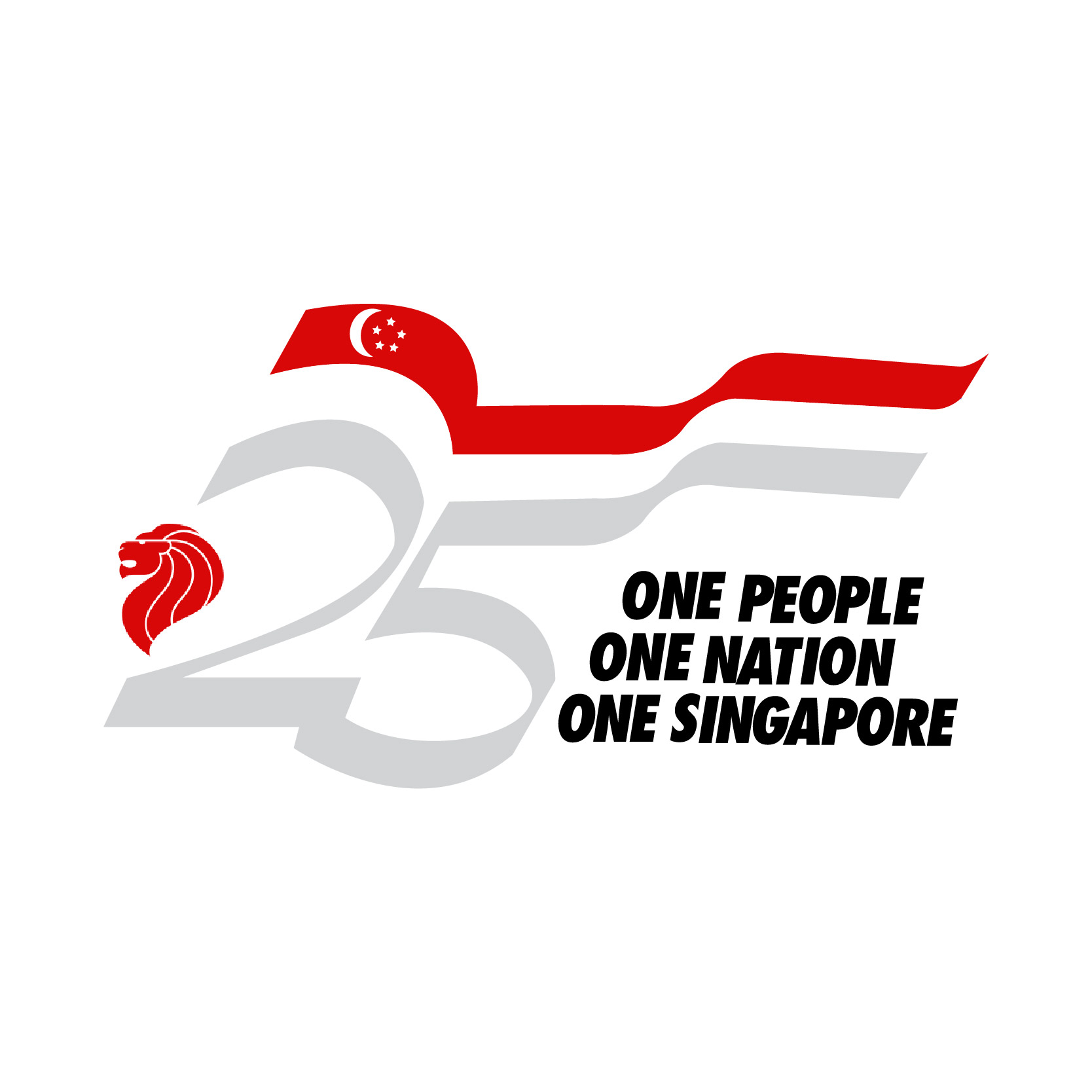
25 One People One Nation One Singapore

Logo to celebrate Singapore's 25th anniversary as an independent nation
| Designer |
Swee Khim Ann (孫琴安),Chong Quek Mee |
||||||||||
|---|---|---|---|---|---|---|---|---|---|---|---|
| Client |
25th Anniversary Celebration Council |
||||||||||
| Year |
1989 |
||||||||||

The official logo for Singapore's silver anniversary. The red represents the national flag and silver for the 25th anniversary. The ribbons represent the celebratory mood and also the continuous flow of the nation from its history of achievements.
Graphic artist Swee Khim Ann took three days to come up with the basic design and concept: a logo that would capture Singapore's progress over the last 25 years and the need to move forward to the next. The self-taught designer, who was the principal graphic artist with the Singapore Broadcasting Corporation, worked with his colleague Chong Quek Mee who came up with the slogan "Forward Together, Singapore Forever". However, her slogan was not adopted. Instead, the 25th Anniversary Celebration Council came up with "One People, One Nation, One Singapore" which is placed on the bottom right of the logo.
The logo was the winning design amongst 2,000 entries submitted in a competition sponsored by GEC Plessey Telecommuncations. It won the duo $4,000.
| References |
|
||||||||||
|---|---|---|---|---|---|---|---|---|---|---|---|