Singapore Airlines

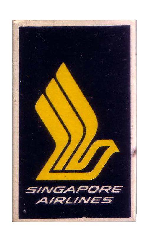
Matchbox featuring a logo of the national airlines
| Designer |
Central Design (中央設計公司),William Lee Siew Choon (李秀镌) |
||||||||||
|---|---|---|---|---|---|---|---|---|---|---|---|
| Client |
Singapore Airlines |
||||||||||
| Year |
1970s |
||||||||||
Dimensions: 57 x 37 mm
The matchbox features a logo of the Singapore Airlines (SIA), formed in 1972 after the Malaysia-Singapore Airlines was split into two. The logo was designed by Walter Landor Associates over a period of nine months, while the branding on its materials was developed locally by Central Design.
Although most were impressed by the new logo, creatives in the industry questioned why local designers were not given an opportunity to work on the project. They also said the design lacked a "local flavour", with one suggesting a flying lion instead.
Defending their firm's work, Rodney McKnew and Taft Tong said they wanted an "international" symbol and not everyone knew that Singapore is the lion city. McKnew added: "[Singapore] comprises exotic people, mostly young. The bird is to create an image that is unusual and exotic, especially for an airline belonging to a country which is unique and individual."
Nonetheless, SIA was not the only airline using a bird logo as it was also used by others including Fancher Flyways in USA and Air China.
In 1987, SIA's identity was refreshed by Landor for some $1 million. While the original bird logo was kept, other enhacements were introduced including a new livery.
Collection of Yeo Hong Eng
| References |
|
||||||||||
|---|---|---|---|---|---|---|---|---|---|---|---|